Books › Kunst der Farbe

Kunst der Farbe
First published 1961 · 160 pages
A rigorous and reverent masterclass in how to truly see, feel, and orchestrate the visual spectrum.
What it feels like
Reading this foundational text feels like stepping into a brightly lit, meticulously organized studio where the secrets of human perception are laid bare. The pace is steady and deliberate, asking you to pause and truly look at the world around you. It blends the rigorous discipline of a Bauhaus master with a deeply spiritual reverence for how hues interact, clash, and harmonize. The prose is precise yet poetic, elevating technical instruction into a philosophical meditation on aesthetics and emotion. It is an intellectual and visual feast that moves from analytical exercises to a profound appreciation of visual harmony. This is a must-read for artists, designers, and anyone who wants to understand the hidden emotional architecture of the visual world.
- Mood
- contemplative
- structured
- intellectual
- harmonious
- Tone
- authoritative
- philosophical
- didactic
- reverent
- analytical
- Pace
- steady
- Themes
- the harmony of contrasts · spiritual resonance of color · visual perception · intersection of science and emotion
- The writing
- Precise and academic, yet deeply poetic when describing the emotional weight of specific hues.
- The arc
- Moves from analytical curiosity to a profound, almost spiritual appreciation of visual harmony.
- Who it's for
- Artists, designers, and visually curious minds who want to understand the hidden architecture of what makes an image sing.
About the book
"Sources of paintings, photographs, and reproductions"--P. 154-155.
Description from Open Library.
Books like Kunst der Farbe
See why they match The elements of colorJohannes IttenA masterclass in seeing that transforms the chaotic spectrum of light into a structured, harmonious language of emotion and design.
 ColorPaul ZelanskiA structured, visually rich exploration that transforms how you see the everyday world.
 Concerning the spiritual in artWassily KandinskyA visionary manifesto that transforms the act of painting into a profound spiritual awakening.
 Point and line to planeWassily KandinskyA deeply cerebral and structured journey into the philosophical foundations of abstract art and visual composition.
 Art and visual perceptionRudolf ArnheimA paradigm-shifting masterclass that rewires your brain to understand exactly why and how we find meaning in visual forms.
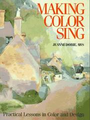 Making Color SingJeanne DobieAn inspiring and practical guide that breathes life into the technical study of pigments and watercolor painting.