Books › Responsive Web Design

Responsive Web Design
153 pages
A clarifying, foundational guide that transforms the chaos of the multi-device web into an elegant, adaptable design philosophy.
What it feels like
Reading this book feels like sitting down with a brilliant, patient mentor who is about to completely change how you see the digital world. The pace is brisk and purposeful, stripping away the anxiety of a rapidly fragmenting device landscape and replacing it with a profound sense of clarity. Marcotte's prose is remarkably conversational for a technical guide, blending philosophical shifts with pragmatic, hands-on techniques. The mood is inherently optimistic and empowering, inviting you to stop fighting the fluidity of the web and start embracing it. It is a deeply clarifying experience that delights designers and developers who crave elegant solutions to complex problems, leaving them equipped to craft digital spaces that are as resilient as they are beautiful.
- Mood
- focused
- optimistic
- clarifying
- invigorating
- Tone
- instructive
- encouraging
- pragmatic
- visionary
- accessible
- Pace
- brisk
- Themes
- adaptability · user empathy · technological evolution · design philosophy · craftsmanship
- The writing
- Clear, conversational, and elegantly structured, translating complex technical concepts into digestible, human-centered advice.
- The arc
- Moves from the overwhelming complexity of a fragmented web to a sense of empowering clarity and control.
- Who it's for
- Web designers and developers looking to future-proof their craft and build more empathetic, flexible digital experiences.
About the book
From the publisher's website: "From mobile browsers to netbooks and tablets, users are visiting your sites from an increasing array of devices and browsers. Are your designs ready? Learn how to think beyond the desktop and craft beautiful designs that anticipate and respond to your users’ needs. Ethan Marcotte will explore CSS techniques and design principles, including fluid grids, flexible images, and media queries, demonstrating how you can deliver a quality experience to your users no matter how large (or small) their display."
Description from Open Library.
Books like Responsive Web Design
See why they match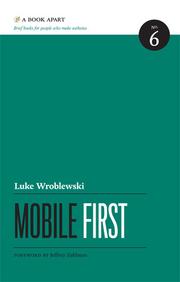 Mobile FirstLuke WroblewskiAn engaging, to-the-point masterclass in rethinking digital architecture for the smartphone era.
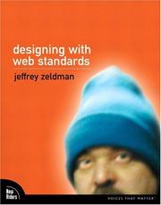 Designing with web standardsJeffrey ZeldmanA witty, passionate manifesto that transforms dry technical standards into an empowering philosophy for building a better web.
 Don't Make Me ThinkSteve KrugA breezy, common-sense masterclass in how to stop frustrating the people who use your creations.
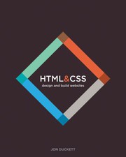 HTML & CSSJon DuckettA beautifully designed, highly visual gateway into web development that feels more like an art book than a technical manual.
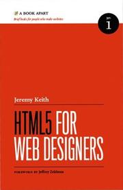 HTML5 For Web DesignersJeremy KeithA breezy, charmingly pragmatic guide that turns a daunting technical specification into an afternoon of lightbulb moments.
 Designing Web UsabilityJakob NielsenA foundational masterclass in stripping away digital friction to reveal the elegant logic of user-centric design.