Books › Information Dashboard Design
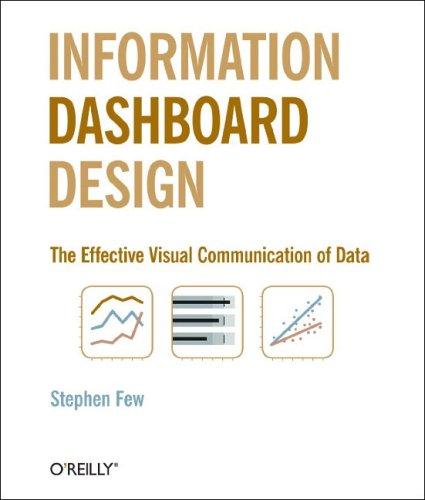
Information Dashboard Design
260 pages
A focused, pragmatic guide to transforming complex data into clear, at-a-glance visual communication.
What it feels like
Reading this book feels like organizing a chaotic workspace into a perfectly streamlined system. It maintains a steady, deliberate pace, guiding the reader through the analytical principles of visual communication and management information systems. The mood is highly focused and intellectual, stripping away the noise of raw data to reveal the satisfying clarity of well-structured design. Its prose is direct and pragmatic, mirroring the very at-a-glance efficiency it teaches. There is a distinct sense of problem-solving throughout, moving from the overwhelming nature of complex metrics to the elegant simplicity of a functional dashboard. It is an essential, clarifying experience for programmers, analysts, and managers who want to master the art of displaying data with precision and purpose.
- Mood
- focused
- structured
- intellectual
- Tone
- instructive
- analytical
- pragmatic
- clear
- Pace
- steady
- Themes
- visual communication · data clarity · efficient monitoring · information architecture
- The writing
- Direct, precise, and highly functional, prioritizing clarity and immediate comprehension over stylistic flourish.
- The arc
- Moves from the overwhelming complexity of raw data to the satisfying clarity of well-designed visual information.
- Who it's for
- Data analysts, programmers, and managers seeking to transform complex metrics into clear, actionable visual displays.
About the book
Source title: Information Dashboard Design: Displaying Data for At-a-Glance Monitoring
Description from Open Library.
Books like Information Dashboard Design
See why they match The Visual Display of Quantitative InformationEdward R. TufteA masterclass in visual elegance that transforms how you see and communicate complex truths.
 Envisioning InformationEdward R. TufteA passionate, visually stunning masterclass in transforming complex data into elegant, comprehensible truth.
 Information is BeautifulDavid McCandlessA visually stunning antidote to information overload that transforms complex data into beautiful, digestible art.
 Storytelling with DataCole Nussbaumer KnaflicA clarifying, highly visual masterclass in turning dense spreadsheets into compelling, persuasive narratives.
 Designing the user interfaceBen Shneiderman and Catherine PlaisantAn authoritative, structured deep-dive into the principles of making technology comprehensible and satisfying for human users.
 Designing interfacesJenifer TidwellA pragmatic, pattern-driven masterclass in making complex digital spaces feel intuitive and human.