Books › The Visual Display of Quantitative Information

The Visual Display of Quantitative Information
First published 1983 · 206 pages
A masterclass in visual elegance that transforms how you see and communicate complex truths.
What it feels like
Reading this book feels like stepping into a beautifully curated museum of human thought, guided by a brilliant, uncompromising curator. It is a steady, visually arresting experience that marries the rigor of mathematics with the aesthetic sensibilities of fine art. The prose is as crisp and minimalist as the data-ink ratio it famously champions, delivering opinionated critiques of bad design alongside reverent analyses of historical masterpieces. You do not just read it; you study it, lingering over the intricate maps and charts that unfold across its wide margins. It is an intellectual awakening for designers, analysts, and anyone who believes that clarity is a form of profound respect for the reader.
- Mood
- intellectual
- refined
- analytical
- visually stimulating
- Tone
- authoritative
- elegant
- precise
- opinionated
- didactic
- Pace
- steady
- Themes
- the pursuit of clarity · elegance in design · truth versus deception · the intersection of art and science · cognitive efficiency
- The writing
- Crisp, aphoristic, and uncompromisingly precise, mirroring the minimalist design principles it advocates.
- The arc
- Moves from a foundational appreciation of historical brilliance to an empowering, critical mastery of visual communication.
- Who it's for
- Designers, data scientists, and anyone obsessed with the elegant, honest communication of complex ideas.
About the book
The classic book on statistical graphics, charts, tables. Theory and practice in the design of data graphics, 250 illustrations of the best (and a few of the worst) statistical graphics, with detailed analysis of how to display data for precise, effective, quick analysis. Design of the high-resolution displays, small multiples. Editing and improving graphics. The data-ink ratio. Time-series, relational graphics, data maps, multivariate designs. Detection of graphical deception: design variation vs. data variation. Sources of deception. Aesthetics and data graphical displays. This is the second edition of The Visual Display of Quantitative Information. Recently published, this new edition provides excellent color reproductions of the many graphics of William Playfair, adds color to other images, and includes all the changes and corrections accumulated during 17 printings of the first edition.
Description from Open Library.
Books like The Visual Display of Quantitative Information
See why they match Beautiful EvidenceEdward R. TufteA visually stunning masterclass that transforms the dry mechanics of data into a gallery of intellectual elegance.
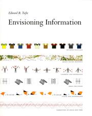 Envisioning InformationEdward R. TufteA passionate, visually stunning masterclass in transforming complex data into elegant, comprehensible truth.
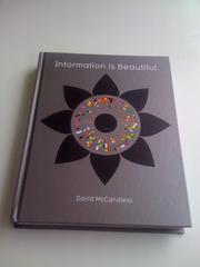 Information is BeautifulDavid McCandlessA visually stunning antidote to information overload that transforms complex data into beautiful, digestible art.
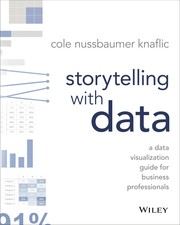 Storytelling with DataCole Nussbaumer KnaflicA clarifying, highly visual masterclass in turning dense spreadsheets into compelling, persuasive narratives.
 Information Dashboard DesignStephen FewA focused, pragmatic guide to transforming complex data into clear, at-a-glance visual communication.
 How to Lie with StatisticsDarrell HuffA cheeky, pocket-sized survival guide for navigating a world obsessed with misleading data.